…my true love gave to me, a stocking just for my kitty!
When my Baking Buddy became a cat dad earlier this year, I knew I wanted to do something special for kitty’s first Christmas. (Yes, he already has an ornament like that.) He’s always made sure that my furkids have something for the humans and their opposable thumbs to unwrap on their behalf at Christmas, and I wanted his new addition to have the same.
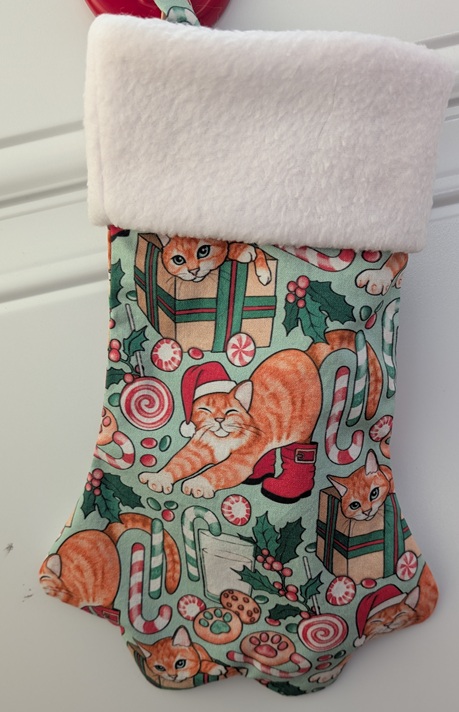
I found a fun paw-shaped stocking pattern (in three different sizes!), and also some fabric on Spoonflower that looks a lot like the cat in question.
Funny story…you’d think that having three stocking sizes to choose from would be enough, but you would be wrong. The regular-sized one sounded human-sized, and the mini felt too small. And don’t get me started on the jumbo! Now I understand Goldilocks’ struggle. In the end I used the pattern for the regular-sized stocking but resized the PDF to 3/4 its original size to strike a balance.
I also left off the foot pads and toe beans. I know! Toe beans! If I had been using a solid colour for the body of the stocking I would 100% have included them (because…toe beans!), but I didn’t want to cover up the fun pattern with them. Besides, human stockings don’t include toenails…right? Help me out here.
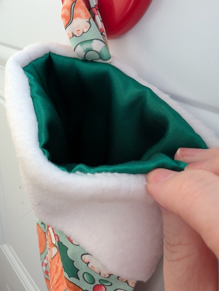
My favourite part – or maybe second-favourite, after the orange cat fabric – is the lining. I found a couple of scrap pieces of green cuddle satin in my stash, left over from a pair of pajama pants, that were just the right size and matched the darker green on the outer fabric admirably. It gives the stocking such a luxe feeling!
I filled it up with all kinds of toys and goodies, including a gift card to the pet store for future treat purchases…and am starting to think there might have been something to the regular size after all. Right now it’s hanging at kitty’s new abode, where she’s patiently waiting until Christmas morning.
I’m not on social media. The idea of mindlessly scrolling my days away is a bleak one indeed. Do these people not have anything better to do with their time? I do, however, have a Pinterest account, which occasionally shows me TikTok videos, and that’s how I came to learn about, and I quote, “Tiny Tuna Muffins for Cats”. How could I not try making them?
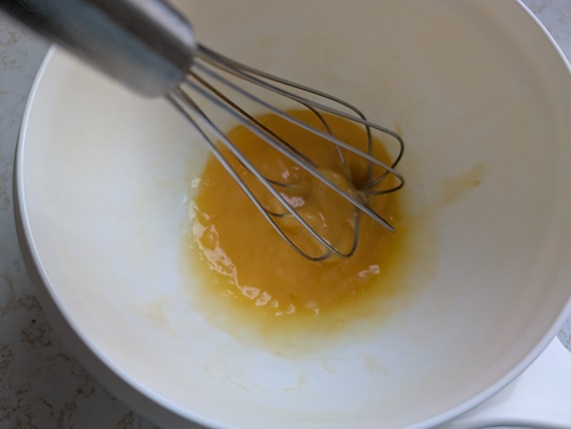
First, I beat one egg:
Then, I drained a can of flaked tuna in water and added it to the egg.
“Mix well”, the video says. No kidding.
To this, I added 1/4 cup each all-purpose flour and shredded cheese.
And then…I mixed well again.
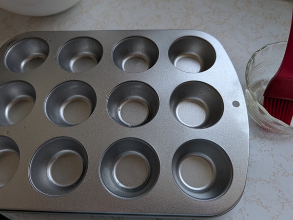
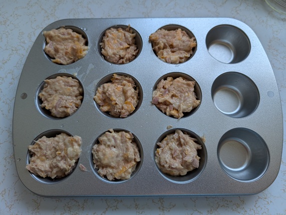
Next, I was instructed to grease a mini muffin tin…
…and add the mixture to the tin. Unlike actual mini muffins or cupcakes, there’s no fear of rising and overflowing, so I filled these pretty much to the top.
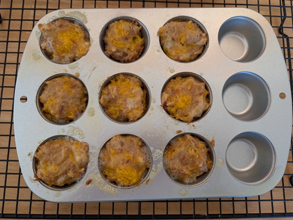
Bake at 350°F for 15-20 minutes.
Let cool and serve.
I have thoughts about these. First, use chunk tuna and not flaked; when I drained the tuna I also drained a lot of flakes out because they’re so darned small. My sink smelled like fish, my hands smelled like fish…ugh. Second, consider whether you want this fish goo touching your baking equipment. I bought a small mini muffin tin from the dollar store specifically for this so that I wasn’t at risk of permanently baking a fish smell into my good tins. Third, know your cats and what they like, and be prepared for any reaction anyway. Mine is a cheese fiend, but after taking a couple of nibbles and licking the fishy/cheesy essence from her muffin, completely ignored it.
Was it a cute idea? Sure. Will I be trying them again? Probably not. Maybe staying off social media isn’t so bad after all.
My Baking Buddy recently experienced the joy of fatherhood. His little bundle of joy weighs about seven and a half pounds, likes to wake him up at 3:00 AM, and meows when he comes home from work (but also at 3:00 AM).
Yes, he is fully in his Cat Dad era, and I couldn’t be more delighted for him.
With Easter coming up, I wanted to put together a basket of some sort for him. I didn’t want to go overboard on candy, because a) who really needs that much candy, and b) a lot of Easter candy is aimed at kids and isn’t super-great. I finally decided on a few pieces of chocolate (Aero lambs come but once a year, so enjoy the bubbles while you can!), a newly-released book in a series he’s been reading, and a shirt to reflect the bliss that is having a furry friend inspect every plate and every glass he’s trying to eat or drink from.
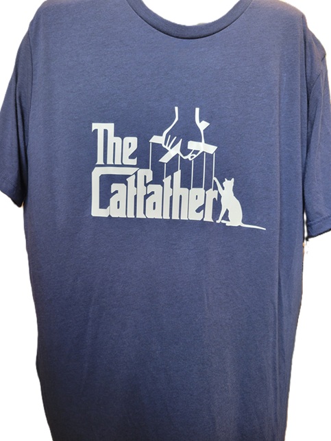
After combing Etsy for “cat dad SVG”, I found this:
Black would have been classic for this but is so overdone, so I opted for a navy heather triblend from Michaels – I think it was Bella & Canvas. The design was cut from white Easy Weed Siser heat-transfer vinyl.
(Excuse the disembodied shirt.)
The vinyl adhered like a dream…I’m so happy with how this came out! He loved it, and couldn’t believe I had made it (despite having worked on vinyl projects with me before). It looks great on him, too.
In a fit of fey inspiration (largely fuelled by wanting an excuse to buy some of the neon yarn I’d been seeing at Michaels, because really, where else am I going to use acrylic neon yarn?), I crocheted a cat-sized party hat.
I found the pattern on Etsy and wound up using a too-large crochet hook and too-thick yarn, and so left a few rounds off the bottom before it turned into a hat for a medium-sized dog. Even with that, it was a little on the large side; luckily, by reshaping the base into a bit of an oval, it would sit further back on the cat’s head and not look quite as ridiculously oversized.
Ever since I first started playing around with heat transfer vinyl, the idea of doing multi-coloured/layered designs was always in the back of my mind. Like so many other things that live back there for “some day”, this was dismissed as being too complicated, and what if it didn’t work? That would be a waste of perfectly good vinyl!
I was finally spurred into action when I saw this hoodie on Modcloth. So cute! So cat-iful! The price was a bit hard to swallow, though. And once the price caught in my throat, I found other reasons to not buy it: with the graphic on the back, people might not be able to see and appreciate it to the full extent possible; they only had a handful of sizes left and were still asking nearly-full price; that’s still a crazy amount of money for a hoodie that’s got a strong seasonal vibe.
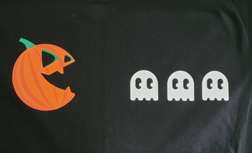
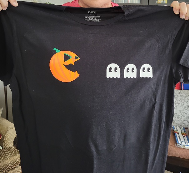
An Etsy search turned up the exact same image as an SVG file for a fraction of the price. (Note: searching for “pumpkin butt” generates a lot of hits for kits to, ahem, paint your infant’s backside orange and turn the resulting print into a pumpkin. Shudder. “Cat butt pumpkin” was a lot more helpful.) I gleefully informed my Crafting Buddy (who is also my Baking Buddy) that I had found our layered vinyl project. He said he wasn’t sure that he’d want a big pumpkin cat butt on the front of his shirt…”but I could see it as a smaller image on the chest, maybe”. Back to my search, where I found something appropriately pop-culture and masculine for his Halloween finery. Once I got the images resized appropriately, I cut out one colour/layer at a time and hoped against hope this would work.
We started with his shirt because the pieces were a bit smaller and easier to wrangle.
This is the back side i.e. the part that gets placed against the shirt. I learned an invaluable lesson: if you’re going to weed everything ahead of time, make sure you have wax paper or something similar between your pieces, or else the carrier sheet will stick to the sheet immediately below and maybe even start peeling the vinyl off.
We started by dry-fitting (cold-fitting, sine this was before heat pressing?) the pieces to see how they would look.
It took some careful placement, but we got the remaining two layers of the pumpkin lined up. The ghosts should probably be a little bit closer to the pumpkin, but we moved them over to centre the design overall.
It looks pretty good! (The colour variance you’re seeing in the black is just from the heat press, and isn’t a permanent feature.)
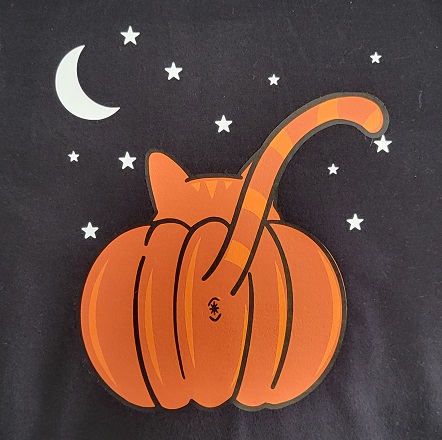
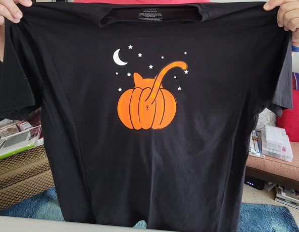
Once we had one under our belts, we assembled my shirt. It was slightly more awkward because of the larger pieces of vinyl.
We got things lined up pretty well, though!
Now we can check “layered vinyl” off our crafty bucket list. I don’t know how often I’ll do it, but it’s a nice trick to have up my sleeve.
Just a short blast for today, because there’s haunting to do…
I love Halloween. I love cats. So cats dressed up for Halloween feels like a no-brainer, especially if I can work a Satsuma Street design into the mix.
One-Eyed Jack is one of their new Halloween ornament designs for 2021. I was too impatient to order and wait for the kit, so I purchased the PDF pattern from her Etsy shop and printed it out at home so I could start stitching right away.
And you know what they say, kids…if life gives you white perforated paper in your stash when a pattern calls for black, grab a Sharpie and make it so (or “sew”). 😉
I altered the pattern slightly to make his markings look a bit more like my parents’ cat, and I left the plumage off his hat, but definitely added all the sparkly beads and sequins as prescribed.
Because I apparently have too much time on my hands, I created (another!) stop-motion video of the process:
He was a big hit, and is currently affixed to my parents’ refrigerator door via the magic of magnets, keeping watch over any tasty treasures that might get put in there.
It’s no secret that I love Satsuma Street design, like this one and this one. This year, I bought Mister Cat after ogling it for what feels like ages. On Etsy, you can buy either the PDF pattern or the kit; I bought the kit from 123Stitch since I already had an order going.
What I liked:
it’s a Halloween cat, duh
her designs are always so colourful and fun
the kit came with black perforated paper, so I didn’t have to buy a whole package of it
What I didn’t like:
the black perforated paper was a bit of a pain to see (like black aida cloth, so no surprise there)
I ran short of three – count ’em, three – colours of the threads included. I am not a novice stitcher who has no idea how to get the most out of her materials, and I didn’t have to unpick and waste any thread, so WTH, people? One, I might understand, but three?
And because I’m a masochistic weirdo, I documented my progress in a series of photographs and turned them into a stop-motion video:
I’m pretty happy with how he came out, despite my issues with the kit. I might have to leave him out year-round just to enjoy him.
Did you know that Darth Vader never uttered the words “Luke, I am your father”? And that Humphrey Bogart’s Rick didn’t actually tell the piano player to “Play it again, Sam”? If you’re swearing up and down right now that those are the right lines, darn it – and maybe you also remember reading Berenstein Bears books as a kid – you’re likely experiencing the Mandela Effect. It’s a psychological phenomenon in which large numbers of people share the same false memory, and so named after the false memory many people share of Nelson Mandela dying in prison in the 1980s (he didn’t, as you might have suspected). This article provides some great examples – as a psych major, I love how weirdly fallible the human memory is.
What does any of that have to do with this project? Nothing, really, except for a common misspelling of near-homophones. Mandela was an anti-apartheid revolutionary. A mandala is a geometric figure representing the universe in Hindu and Buddhist symbolism.
Guess which one I recently stitched up for the Hoopless Hoopla swap on Lettucecraft?
My partner mentioned she’d like something featuring blue, pink, and/or gold, and had listed mandalas as one of her themes, and it felt like a perfect dovetailing of aesthetics. When I set about searching for a design, I inadvertently saved the same one twice, which I took as a sign that it was the one.
I don’t know who designed this, but isn’t it gorgeous? When I looked at it, my eye automatically divided it into three sections, and I decided an ombre effect would suit it perfectly.
I used DMC shades 3843, 3845, and 3846, the latter of which used a huuuuuge amount because I neglected to account for the fact that each successive “ring” would be so much larger than the last. I had enough, but boy, was I kicking myself for picking a design with such an intricate outer circle.
(And honestly, despite my griping, it’s not that big: only five inches across.)
Some gold seed beads added a touch of elegance and brought the design up to the next level. I agonized over the beads longer than I should have, and tried about ten different iterations of seed beads vs. E beads vs. both, but in the end decided to keep them small and subtle.
I was pleased with how this came out and hoped that my partner would like it, too (spoiler alert: she did). But I positively squealed at the cuteness of what she sent me:
Isn’t that lovely? I love the elegance of blackwork, and those tiny pops of red in the flowers positively make this.
The second round of swaps on Lettucecraft recently took place, and I signed up for the Adult Merit Badge swap as fast as my little fingers could complete the questionnaire. I was never a Girl Guide, but I love me a merit badge! My partner listed ten different possible themes to choose from, and I was thisclose to working with “Coffee” when I started Googling bad science puns (she’s a biology teacher, and had listed “Science” as one of her themes). Before I knew what was happening, “Coffee” was all but forgotten, and darn it, I was going to dad-joke the heck out of “Science”.
It was a bit of a masochistic choice on my part, because I am not a science-type person. In Grades 11 and 12, we were made to choose at least one science class of the “big three” to take: Biology, Chemistry, and/or Physics. This was exactly one more science class than I wanted to take. Why not an extra period of French instead, so I could hinky dinky parlez-vous with the best of them? Or English? Never mind that I probably already gave Mr. Klymko a Level-5 Motrin headache on a daily basis anyway: this was my education we were talking about.
I eventually opted for Physics for two solid reasons. Primo, it seemed the “cleanest” and the least likely to feature funny smells, oozing, or explosion; secundo, my aunt taught Chemistry, and I thought it might be weird. (This was really terrible logic on my part, because she taught me math in Grades 10 and 11 and I actually understood it for the first time for reasons that had nothing to do with our shared name. And if I had known that I’d take up recreational baking, I would have volunteered to learn about chemical reactions in a heartbeat.) Because Physics was also the hardest of the three and didn’t garner a lot of wiling victims, the school combined the Grade 11 and 12 students into one class, and we covered both levels in one academic year. Every single day of Grade 11, I had double Physics, and it was brutal. (But! Having gotten both years out of the way at once, my Grade 12 schedule was such that I had the entire afternoon free every other day, so I can’t say no good came of it.)
Biology, however, was a bit of newish territory for me. Through the magic of the internet, I found a picture I liked, to use as inspiration for my badge. My partner told me she has a purse where she affixes any badges she accumulates, and my hope was that her students would get a kick out of this one, too.
Oh, how I love working with felt! The badge is about 3″ high from top white border to bottom white border. When I first found my “inspiration image”, I honestly had no idea whether all the little bits contained in the cell were accurate, but through research I discovered that yes, they were – this is a rough representation of an animal cell!
I made my nucleus and cell phone out of felt, but embroidered the facial features and, in the end, the mitochondria and the vacuoles. I had initially cut small bits of felt for the latter two, but the bright red and green felt made it look like a Christmas ornament and not, you know, an actual science thingie. The satin stitch I went with instead wasn’t a tremendous effort, and helped the overall appearance, I think. Once I had all my features stitched on, and my layers of felt where they ought to be, I added a white backing to hide the stitches.
A close-up, for good measure:
My partner really liked it, which is a huge relief! Her comment: She even got the detail of the endoplasmic reticulum being attached to the nucleus. I just smiled and nodded – although I do know which one the nucleus is!
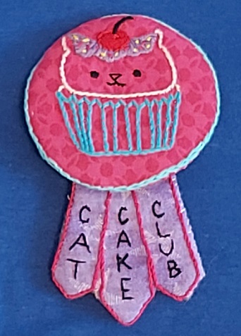
Wondering what I got in the mail? My partner absolutely nailed it, and did a mash-up of my “Cats” and “Cupcakes” themes.
Her daughter helped pick out the colours, which are honestly so perfect purrfect for something cupcake-themed. She even attached a safety pin to the back of it for easy wearing and removal, which is the ultimate thoughtful detail.
It’s so nice to have the swapping up and running – I love being able to craft outside of my usual comfort zone.
When I adopted my oldest from the local humane society, they lined her carrier with what I think was once a pillowcase (essentially, a nondescript piece of flannelette-like material) for the ride home to ward off the January chill. When I adopted my second, they tucked into her little cardboard carrier a small afghan made of six blue-and-pink granny squares. I’ve still got the cat, and her “baby blankie”, and the blankie gets treated with kid gloves on laundry day: gentle cycle, lay flat to dry.
It probably shouldn’t surprise anyone that when I got it in my head that I wanted to learn how to crochet, I practiced the basics by crocheting simple squares to be sewn into blankets for the humane society. I don’t exactly work on them tirelessly, but it’s proven to be something to occupy my hands while I watch TV or talk on the phone, and over the past while I’ve managed to churn out six:
In approximate chronological order:
Unlike the others, which are made of a worsted-weight yarn, this giant granny square is made from a baby yarn and it’s so soft:
I was really excited about this one! It gave me a chance to try some different techniques, and provided wonderful justification for keeping back issues of Bust magazine:
Hopefully these will help some other kitty settle into his or her furever home.
And yes, my cat still sleeps with hers:
Thanks for looking – and remember: adopt, don’t shop! 🙂