…my true love gave to me: a French hen to go with my two turtle doves and partridge in a pear tree!
By the time Satsuma Street released their holiday designs last year, I was done with taking on last-minute crafting projects. (Excuse me while I snicker behind my hand.) That didn’t stop me from buying the charts, though: one of them was the third installment in the 12 Days of Christmas series, and since I had stitched the first two last year it was a given I had to do this one as well.
Mon dieu! A French hen!
I didn’t think to take a picture of the back, but once I was finished stitching and attaching the beads and sequins, I glued it to glittery white felt so it will shimmer no matter how the lights catch it.
The four calling birds have been released, so I’ve got at least one project for next year lined up already.
…my true love gave to me: a card with a greeting merry!
For the second year in a row, I signed up for the Christmas Card swap on Lettuce Craft, because who doesn’t like getting a little festive mail? Or mail in general, really?
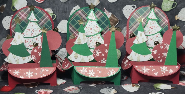
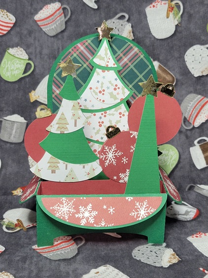
Last year, I kept things fairly simple with a bit of embossing powder and die-cut messages (trust me, it’s simpler than it might sound), but this year I apparently lost all sense of reason when I saw the Christmas Trees box card on SVGCuts. This had presence, drama, and a great reason to play with some fun patterned papers that mysteriously find their way into one’s stash but don’t get used for being “too busy”.
Speaking of patterned papers: trying to decide on a colour scheme was pretty much impossible. In the end, I made three cards in a traditional red-and-green theme, and the other three using fun mid-century pinks and teals. The traditional set got gold stars and ornament hangers, and I used silver for the mid-century set. I stamped the back of each card with a fun, festive message that still left plenty of room to sign. The pattern came with a little train to attach to the inside front of the card, but I left it out to make things all about the trees.
I wouldn’t say that making six 3D cards was a mistake, but it sure was an undertaking. The actual assembly wasn’t so bad – I hit upon a rhythm and system that got me down to about 30 minutes of gluing and positioning per card – but cutting out all the different pieces and keeping them sorted until I could put them together was a challenge. I started by making little piles for each card, starting with the solid coloured base and then setting subsequent stars, tree bits, etc. on top, and then putting each little group into its own envelope to wait patiently to be glued together.
The other challenge came when it was time to mail them. When folded flat, they’re 7 inches square (or as square as you can be with irregular edges), which is bigger than most envelope sizes commonly found in stores. Sure, there are 9″ x 12″ envelopes for letter-sized paper, but that felt like overkill. I found some 7.5″ x 10″ “catalogue envelopes” at Staples which fit the bill nicely. And then…I worried that they would get bent in the mail, so I made little cardboard sleeves to give them a bit of stiffness. Some people helicopter-parent their kids; I do it to my crafts.
Luckily, my over-packaging seems to have worked: four out of six partners have received them so far, and they’re standing just as straight as they did before mailing.
…my true love gave to me: some Grinchy little guys for the tree!
In unpacking the Christmas decorations this year, I came to the realization that wow, there were a lot of cross-stitched pieces in there, and I might have a problem. There were cross-stitched representations of the cats, typographical hoops, and a whole bunch of ornaments stitched on perforated paper. (And that’s not counting the older ones, stitched on flexible vinyl Aida, that are blocky and weird by contemporary design standards.)
Of course, even if I had (re)discovered this sooner, it likely wouldn’t have stopped me from working up these guys. I had had the pattern in my Etsy favourites for a long time, and finally had the chance to stitch it.
Because the design is so small, and because my Q-snaps are…not that small, it was easier to cut a piece of fabric (iridescent Aida for the win!) large enough to accommodate three repeats of the pattern than to struggle and curse a piece sized for one. I folded the strip into thirds, found the centre of each third, and set to stitchin’.
When they were done I washed and pressed the whole big piece, then cut the thirds apart and mounted each one in a 3″ wooden hoop. I had briefly debated painting the hoops somehow (or maybe spray them with glitter spray paint) but thought the understated look worked well for someone who stole Christmas before promptly returning it. He’s definitely adopted a pre-epiphany stance here.
A friend has called dibs on one, and I’ll be keeping one, leaving me with an extra to hang somewhere or keep up my sleeve as a crafty add-on to a gift.
Ever since I first started playing around with heat transfer vinyl, the idea of doing multi-coloured/layered designs was always in the back of my mind. Like so many other things that live back there for “some day”, this was dismissed as being too complicated, and what if it didn’t work? That would be a waste of perfectly good vinyl!
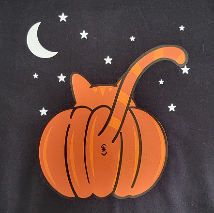
I was finally spurred into action when I saw this hoodie on Modcloth. So cute! So cat-iful! The price was a bit hard to swallow, though. And once the price caught in my throat, I found other reasons to not buy it: with the graphic on the back, people might not be able to see and appreciate it to the full extent possible; they only had a handful of sizes left and were still asking nearly-full price; that’s still a crazy amount of money for a hoodie that’s got a strong seasonal vibe.
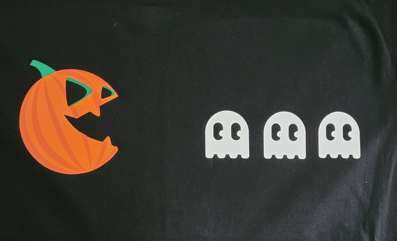
An Etsy search turned up the exact same image as an SVG file for a fraction of the price. (Note: searching for “pumpkin butt” generates a lot of hits for kits to, ahem, paint your infant’s backside orange and turn the resulting print into a pumpkin. Shudder. “Cat butt pumpkin” was a lot more helpful.) I gleefully informed my Crafting Buddy (who is also my Baking Buddy) that I had found our layered vinyl project. He said he wasn’t sure that he’d want a big pumpkin cat butt on the front of his shirt…”but I could see it as a smaller image on the chest, maybe”. Back to my search, where I found something appropriately pop-culture and masculine for his Halloween finery. Once I got the images resized appropriately, I cut out one colour/layer at a time and hoped against hope this would work.
We started with his shirt because the pieces were a bit smaller and easier to wrangle.
This is the back side i.e. the part that gets placed against the shirt. I learned an invaluable lesson: if you’re going to weed everything ahead of time, make sure you have wax paper or something similar between your pieces, or else the carrier sheet will stick to the sheet immediately below and maybe even start peeling the vinyl off.
We started by dry-fitting (cold-fitting, sine this was before heat pressing?) the pieces to see how they would look.
It took some careful placement, but we got the remaining two layers of the pumpkin lined up. The ghosts should probably be a little bit closer to the pumpkin, but we moved them over to centre the design overall.
It looks pretty good! (The colour variance you’re seeing in the black is just from the heat press, and isn’t a permanent feature.)
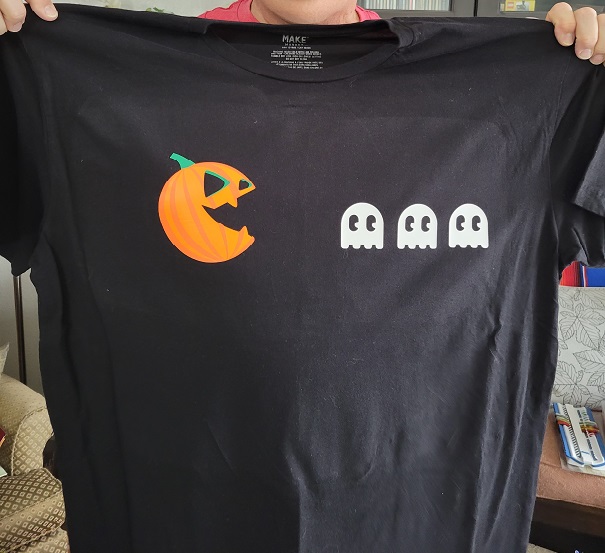
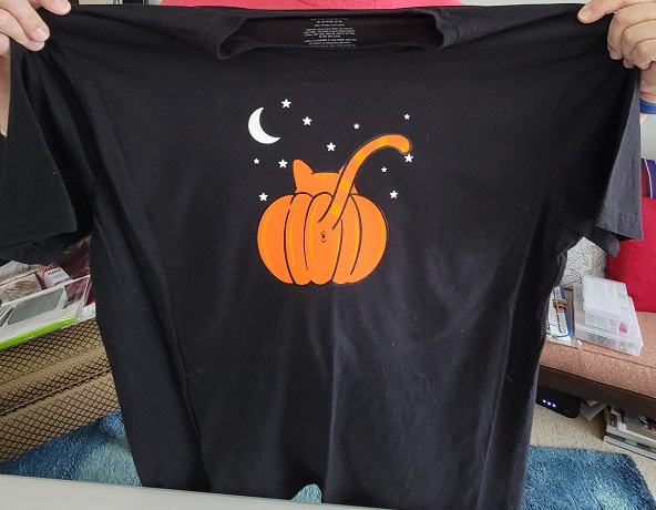
Once we had one under our belts, we assembled my shirt. It was slightly more awkward because of the larger pieces of vinyl.
We got things lined up pretty well, though!
Now we can check “layered vinyl” off our crafty bucket list. I don’t know how often I’ll do it, but it’s a nice trick to have up my sleeve.
Is anyone else noticing a proliferation of celestial-themed everything out there lately? When I was in high school, that kind of stuff was everywhere, and I’m pretty sure my mom still has the moon-and-stars ironing board cover I picked out for her. I’d like to think I’ve matured since high school: I don’t plan my days based on my horoscope, have stopped following those “get this gift for the person in your life with that zodiac sign” guides that were a staple of every November or December issue of Seventeen and YM, and only use “Mercury is in retrograde” ironically. Lo, the fully-functioning adult, basing her life on fact rather than vague character descriptions.
All of that newfound maturity and composure was out the window when a zodiac swap was being planned on Lettuce Craft a few months back. As luck would have it, I had just finished a large-ish crafty commitment, and my fingers were itching for a new project. Surely this was written in the stars! Or…not. Due to a lack of interest, the official swap got cancelled, but the only other would-be participant reached out and asked if I was interested in doing a personal swap with her. Ooh! This was written in the stars!
My partner was a Capricorn. I’ve had a lot of Sagittariuses (Sagittarii?) in my life, but the only Capricorn I grew up with was my best friend from Gr. 3 – 10, and she just didn’t embrace the whole astrology thing. After doing a bit of online research, I was pretty well-versed in traits, colours, everything. And although we were only supposed to make one item, I wound up making two. It happened like this…
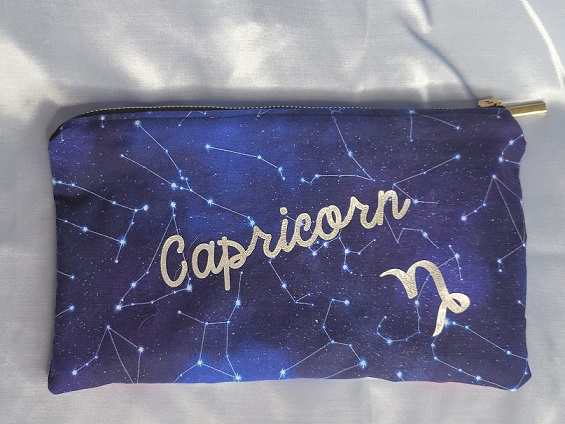
When we first exchanged questionnaires, one of my partner’s “wish” items was a zipper pouch. I was psyched, because even my rudimentary sewing skills should have been able to handle that. She went on to say she liked bright colours, as well as earth tones, but “not too much pink”.
When I got to the fabric store (any excuse for a trip there!) and found the section housing appropriately astrological prints, the designated Capricorn print was pink. Of course. That didn’t stop me buying a bit of it, as well as varying cuts of a few other prints. Nothing said I had to use the pink fabric for the entire pouch, right? Maybe I could combine them somehow. Sewing is one thing, but I’m not a quilter, a planner-of-attaching-pieces-to-other-pieces. I let my fabrics languish for a while (this is very much the approach I took to my t-shirt quilt, albeit over a shorter time frame), and started cruising the internet again.
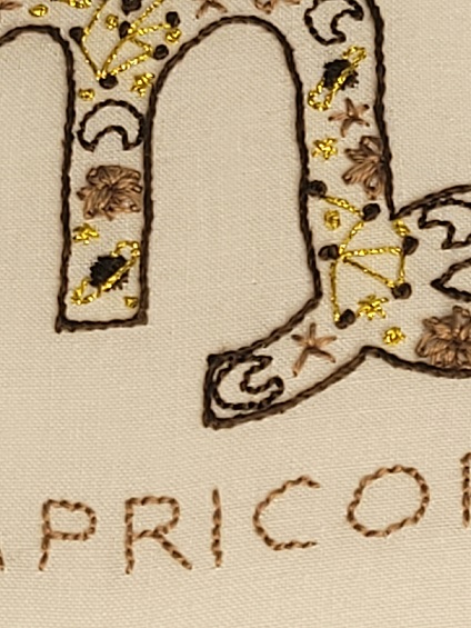
Etsy saved the day with this fun embroidery pattern. Finally, something right in my wheelhouse! I wasted no time in downloading the PDF and transferring it to some Kona cotton I had bought a few years ago for the sole purpose of embroidering. The only thing I did a little differently was changing up the order of the stitches from what the accompanying guide recommended: the outline of the symbol was one of the first parts stitched in the guide, but I left it until the very end to ensure no other stitches (looking at you, lazy daisies!) would breach the edge of the design.
This was a complete joy to stitch. The pattern and colours were something I would normally never have done for myself or others in my immediate circle, and yet they worked together so well.
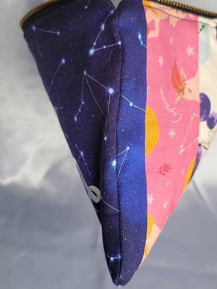
That still left the issue of my zip pouch. I found a zipper I liked and measured its length to determine how wide my fabric would need to be. From there, I cut strips of three different fabrics and sewed them into one big rectangle. Fun fact: despite much calculating on my part, my Franken-rectangle turned out to be longer than the zipper – still, better too long than too short, right? That’s what scissors are for! I decided the other side didn’t need to be as busy, and used just a single fabric for it, making sure it was the same as the outside strips on the other side to allow for some continuity at the side seam.
I cut out the word “Capricorn” and its symbol using the Silhouette and some metallic silver heat transfer vinyl just to stop the other side from being completely plain and positioned it at an angle for visual interest.
Oh, and used some elegant moon-phase fabric for the lining.
My partner said she loved everything, and I’m pretty sure my sigh of relief was heard around the world. Between reliving my horoscope-obsessed high school days and crafting something just a little bit out of my comfort zone, this was a really fun swap.
Hard to believe, isn’t it? On August 21, 2008 I hit the “Publish” button on my very first post. I wanted to post something fun to commemorate the occasion, so here is the UFO to end all UFO’s.
Many, many years ago, three things happened in glorious synchronicity. I was the thinnest I had been in my life. I had a job with an extremely casual dress code. And (it’s impossible to overstate this) graphic t-shirts were seemingly everywhere. They’ve been around forever, I know, but suddenly there were swaths of them. This resulted in my amassing a collection to rival the local stores and turning a t-shirt and flared jeans into my de facto uniform.
Times change, though, and I moved on to a job that made us dress like we were in an office. T-shirts were still weekend wear, but some of them got a little small. Some new ones came into the closet, jockeying for space with the old ones. I’m a sentimentalist with a memory for detail, and couldn’t just get rid of most of them – they all had a story! I had seen t-shirt quilts in craft books before, but that felt like a really big project. (One of them assumed the crafter might not have enough t-shirts and provided instructions for using ink-jet transfer paper to create their own specifically for the purpose of cutting them up to sew.) Still, the idea was intriguing, and I started pulling shirts from my collection and setting them aside.
Reader, I gathered 30 in all. 30! I had no idea I owned that many, or at least, I was subconsciously repressing that knowledge.
Now, where was I? Oh, yes. I pulled the shirts, arranged them in a quasi-rainbow to get a feel for the balance of colours, and promptly ignored them for…a while. What was I supposed to do with them? Where should I start? This is what I get for picking a project that didn’t come with its own pattern.
Eventually, I decided squares would be easiest. I got a 12″ square peel-and-stick floor tile from the hardware store (genius!) and used that as a template, centring it on my shirts and then running the rotary cutter around it. This method meant that I actually got two 12-inch squares from each shirt – front and back – and for a brief moment I considered assembling the plain back squares into the backing of the quilt. Thank goodness I didn’t, because I’d probably still be sewing it today. The upside is, I now have 30 ultra-soft 12-inch cleaning cloths as a nice eco-friendly alternative to paper towels. I arranged and rearranged my 30 front squares until I had a 5 x 6 grid I was happy with. I took a picture for future reference (still more genius!), and then…ignored them for a while. Yes, there’s absolutely a trend developing here.
I knew I wanted a non-stretchy fabric in between my squares to prevent, well, stretching and distortion later on, and picked up some inexpensive solid-coloured flannelette that fit the bill nicely. I cut strips 12″ long by 2″ wide out of blue flannelette, and cut 2″ squares out of pink to go at the “intersections”. I didn’t think to take any pictures of this, but I did ignore it for a while after getting my pieces cut out.
When I was ready to assemble, I started making horizontal rows of five shirts, with a 12″ x 2″ strip between each one (for a total of four blue strips per row). Does anybody want to hazard a guess as to what happened? That’s right – I sewed “filler” rows of five blue strips with four pink squares in between, to eventually go in between the t-shirt rows…and then I ignored them for a while.
It might sound like there was a lot of ignoring going on, and while that’s true to a degree, I’m grateful this wasn’t the kind of project that had to sit out in the middle of the floor or dining room table while it was being ignored. In fact, it was something that could be sewn in steps and would have been a reasonably quick project were it not for the stashing away and ignoring.
Somehow, I managed not to lose any of my rows (t-shirt or straight flannelette), and slowly…painfully slowly…would pin and sew on a row at a time here and there, as the mood struck me. The rows were about five feet long, less seam allowances but plus flannelette strips, and needed to be laid out carefully on the floor for pinning. I had to be mindful not to stretch any of the t-shirt squares (although it did happen, at least a little bit), and found it was easiest to start by lining up my pink squares in the filler rows with the blue strips in my t-shirt rows. Once I had done that, I just had to keep the t-shirt and the corresponding blue strip lined up.
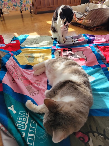
Sometimes, I had help!
At long last, all six t-shirt rows and five filler rows were sewn together into one big piece that actually looked like it was supposed to. A traditional quilt includes a layer of batting in the middle and then a backing, but I’m not a traditional quilter. I bought some pink fleece for my back, figuring it could do double duty as the warm and snuggly part, too. I cut it to size and then lined it up with my quilt top (wrong sides together) and ran a zig-zag stitch all the way around to hold the layers together before adding my binding, which I also attached with a zig-zag stitch.
The other thing I didn’t do that might shock quilters is…I didn’t quilt it. I had weighed the merits of “stitch in the ditch” around my pink squares vs. going old-school and tying yarn through my layers at strategic points, and then decided against both. There’s no batting inside to move around and bunch up in one corner, and the fleece tends to stick a bit and stay put, so once this baby was bound, it was done.
My old photo ID for work featured me in this shirt:
In all, it took me just shy of nine years from the initial pulling of shirts until the final stitch. When I said UFO, I meant it! But oh my stars, was it ever worth it. It’s the perfect weight for a summer cover instead of my comforter, soft and snuggly without being too heavy. It would probably make a great picnic blanket, but I will not be risking grass stains after how long it took to get it finished. In the time since I first started gathering my shirts for this project, I’ve easily acquired that many again (and probably more)…so who knows; there may be another, hopefully quicker, t-shirt quilt in my future.
Today’s musical inspiration is courtesy of Sam the Sham and the Pharaohs:
Years ago, I found a recipe for the charmingly-named Man Catcher Brownies in a magazine. Brownies are good, but brownies with a layer of caramel in the centre? Yes, please. I’ve made them several times and even shared them with coworkers, and somehow don’t have a harem of husbands, so perhaps the name is a bit of an exaggeration. Ahem.
Recently, I was leafing through one of my mom’s cookbooks. When I hit a recipe for saucily-named brownies, I glanced at it briefly before realizing that this was exactly the same recipe. There were a couple of minor tweaks; for example, how the second brownie layer was added, and a heck of a lot more caramel, but otherwise this was it. And despite having had the recipe in my collection for ages, I was suddenly craving them again. Luckily for me, my Baking Buddy was all in.
(You can find the recipe for Man Catcher Brownies here. The recipe comments include a step-by-step video from the girl who originally submitted the recipe to the magazine, so these are the originals, folks!)
First, we gathered our ingredients:
I have a question for my American friends, if anyone wants to chime in down below in the comments. Are you guys experiencing an ever-shrinking selection at the grocery store, too, or is that just happening here? Every single version of the recipe I’ve seen calls for a German chocolate cake mix, and if I had to wait to find one, these babies would never get made. It feels like over the last…ooh, decade or more, for sure, and probably much longer, all the grocery chains have been supplanting their previously wide array of certain products with their own store brand, leaving us with only a few token flavours/varieties. There is no orange cake mix, or German chocolate cake mix, or strawberry cake mix. We’re lucky to have a choice between devil’s food and regular chocolate. Meanwhile, President’s Choice, Compliments, and Co-op Gold all pop up like so many weeds. I’m pretty sure the same thing is happening with Jello flavours too (remember Berry Black?), and possibly canned soup. And yes, we bought a store brand mix for this because it’s not being used for an actual cake, but I’m sure the holy spirit of Huncan Dines (apologies to V.N.) is furious.
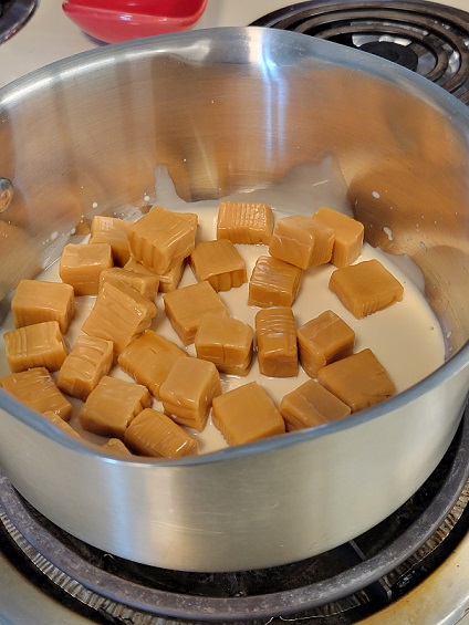
The most tedious part of this is unwrapping all the caramels…
I promise it’s worth it, though! With a little evaporated milk, these form a beautiful soft centre for our brownies.
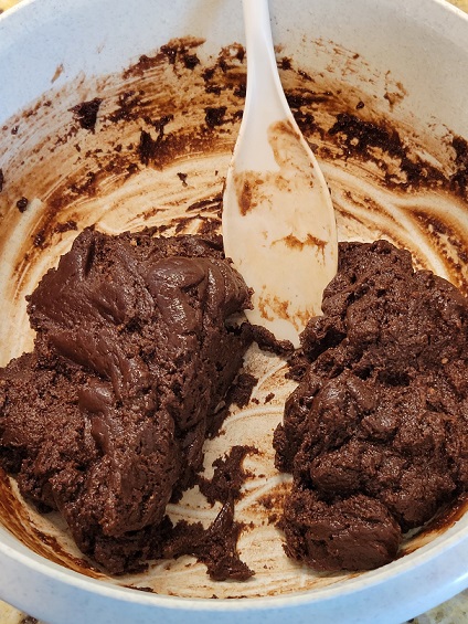
Meanwhile, the cake mix, melted butter, and more evaporated milk get mixed together. The dough turns out really stiff, which makes this parting-of-the-Red-Sea trick really easy.
I did what felt like the logical thing, and divided it in half – half for the bottom and half for the top, right? Makes sense. The only problem is that half of this will not quite cover the bottom of a 9″ x 13″ pan, and you’ll need to borrow some from the top’s share. I had forgotten this from the last time I made them, and suddenly the fact that the version of the recipe in my mom’s book uses a 9″ square pan makes a lot more sense. After some mild cussing on my part, my Baking Buddy took over to get the dough pressed into the corners of the pan, and then we threw the whole mess in the oven for 7 minutes. The process of baking and puffing-up hides a multitude of sins, and I was already feeling better.
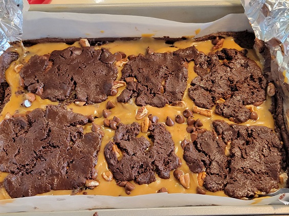
Now it’s time to top it! First, the caramel sauce gets spread over everything:
The partially-cooked bottom layer is quite delicate at this point, and spreading the caramel too vigorously will tear it. Once we were happy with our caramel coverage, we sprinkled some pecan pieces and semi-sweet chocolate chips over it, and then topped with the remaining dough. The problem with using more than half the dough for the bottom is that there won’t be enough to completely cover the top.
By this point, I was ready to pitch the whole thing, because really! But much like the bottom puffed up after baking, so too did the top after we stuck it back in the oven.
I don’t think anybody is going to be fooled into thinking that the top is completely covered (it’s not), but it was an improvement for sure. A little peekaboo caramel never hurt anyone, right?
The recipe is pretty adamant that they cool completely before slicing, so we waited patiently.
They sliced like a dream! And once they were cut into itty-bitty pieces (we got 32 from our pan), the exposed caramel wasn’t nearly as noticeable – it became more of a hint of what was to come than a huge breach in the middle of the pan.
Look at that lovely gooey caramel!
We layered ours between parchment in an airtight container, but these would make a perfect homemade gift for someone presented in a cute little treat box.
Last summer, Michaels* had included, in one of their daily promotional emails, a link to a tutorial to make a tie-dyed Canada Day t-shirt. My tie-dye buddy and I (he’s also my baking buddy; truly, he’s a jack of all trades) bought white t-shirts and a bottle of red dye, and…never got around to applying one to the other. Whoops.
Fast-forward to this year: back in May, I was putting a file at work in abeyance for two months, which took me to July 1. Hey – we had time to get them done this year! We found last year’s stash still in its plastic bag from the store, and I set to finding the tutorial from last year. It was underwhelming, to say the least.
Step 2
Follow the directions on the package for best results and dye patterns.
Really, Michaels*?
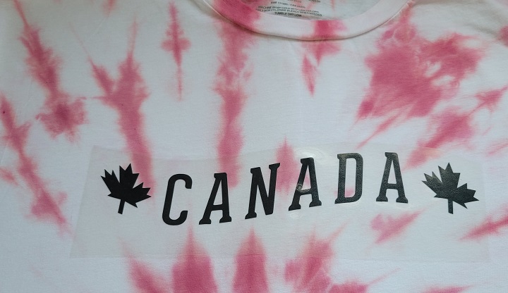
The package directions weren’t much better, and didn’t seem to offer the pattern shown in the picture, so we decided to dispense with their “rules” and choose our own pattern adventure. He wanted his to look like a Canadian flag (-ish), and I opted for a classic swirl, hoping against hope that I wasn’t going to look like a peppermint candy when all was said and done.
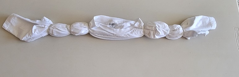
After a quick dunk in soda ash, they were ready for dyeing. Besides the single bottle of red we had bought last year, we found a couple other partial bottles of red in our stash and thought, “Why not?” I don’t know that it made a huge difference, but I’d like to think they lent a certain depth of colour.
Rinse time! His turned out beautifully, but I should have gotten down into the folds of mine a little bit more with the dye. But I can’t be too upset, for two reasons: 1) if I had wanted a solid red shirt, I would have bought one, and 2) the swirl lines came out well, and don’t look like Christmas candy. I’ll call that a win. If I squint, it looks a bit like a burst of fireworks, which is certainly a propos.
But wait, there’s more! The original tutorial had “Canada” in a pretty unremarkable font, straight across the chest. We found a design we liked on the Silhouette Design Store and edited it so we were left with this:
I found some inexpensive placement guides on Amazon to help centre designs on t-shirts and make sure they’re a reasonable distance from the collar, and the adult-sized one proved to be immeasurably (or actually, measurably) helpful here.
The final product(s):
Thanks for looking! 🙂
*Is anyone else bothered by the fact that the founder of that craft chain opted to not add an apostrophe and make it possessive? It takes everything I have not to spell it as “Michael’s”. And every time I see “Michaels”, I expect to see messieurs Keaton, Caine, Bolton, etc. all lined up, rather than aisles of craft supplies.
My latest kitchen experiment was borne out of wanting to avoid the restaurants on Mother’s Day. It’s right up there with Valentine’s Day as far as overcrowding and the antithesis of a relaxing, enjoyable meal. Luckily, I had recently borrowed The Superfun Times Vegan Holiday Cookbook from my local library, and had tons of inspiration.
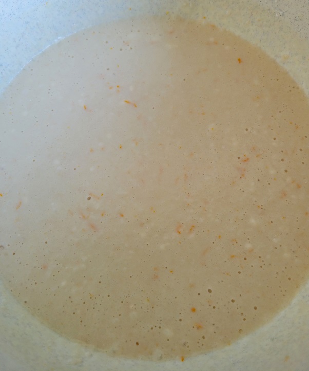
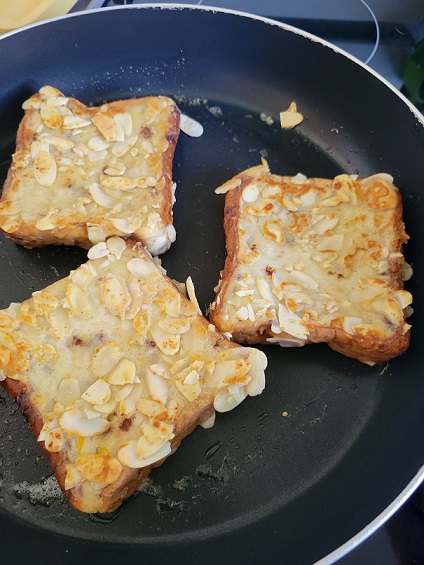
I opted for almond-crusted French toast, and although “crusted” isn’t a super-appetizing word (it makes me think of the top of the ketchup bottle), this was delicious! It’s not my recipe to reprint, but it’s similar to this – only vegan, so coconut milk for thickening instead of eggs – although there’s no cinnamon in the mixture. Instead, add in some orange zest: the recipe called for a teaspoon, but I chose to zest until my orange was zest-less, because a little extra flavour never hurt anybody.
Speaking of unappetizing: there was something a little off-putting about soggy bread with almond slices stuck to it. I got all of my bread dipped and almond-ed while I waited for my pan to heat up, and seriously had my doubts before the first side turned golden brown.
But before long, we were cooking (ha! In more ways than one).
In a moment of inspiration, I peeled the orange who had so bravely given its zest to the cause and served it on the side as a juicy little amuse-bouche. Who knew that citrus could be so tasty outside of the usual season?
This couldn’t have turned out better. The orange flavour really came though in the toast, and the almonds provided a wonderful crunch. The best part? It takes less than half and hour to make, so this is a lot of impressiveness for such a short amount of time. I made some for a friend for lunch the following weekend, and it tastes just as good when you’re not trying to avoid crowds.
I can’t remember when I first encountered them, but every Easter the German bakery near me makes these…well, I’m not quite sure how to classify them. (Oh, this post is off to a great start!) They look like they could be cookies – they’re sized to be held in one’s hand and not so complicated that a fork is required – but they’re thick and puffy and in cross-section almost look like a small, not-very-moist, sturdy cake. And one of the staff members once commented on them using a yeasted dough…does that make these bread? The bakery itself coyly calls them “Bunny Faces”, and they usually get consumed so quickly that no one’s taking the time to reverse-engineer them to put a label on them.
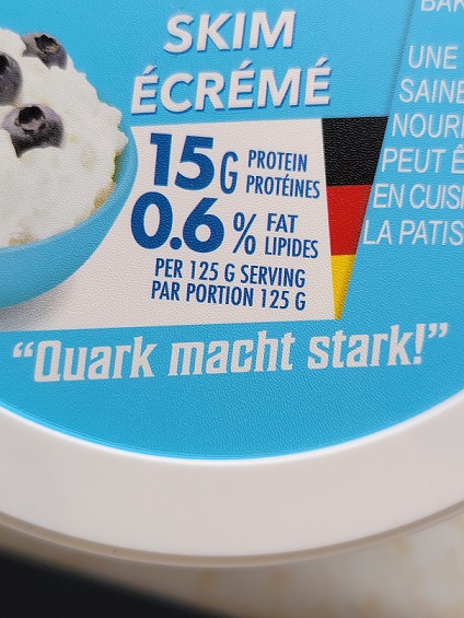
Some careful googling took me down a rabbit hole (ha!) to this recipe. Sure, the ones in the picture had clearly used a different bunny-shaped cookie cutter, but these were them! Finally, I could make these, and…uh, what’s quark? I had never heard of it (much less seen it in a grocery store), but every person I spoke to who was of German or quasi-German descent knew immediately what I was talking about and pronounced it differently than I had been. (Because I know you’re curious: I had been saying the last part of the word like “orc”, but it’s really like “arc”, or “ark”, depending on whether you’re doing geometry or building a boat of epic proportions.)
That all changed this year, when a chance detour down the dairy aisle yielded this:
“Quark makes you strong!”
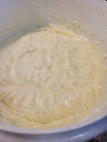
I twisted my Baking Buddy’s rubber arm to help me with these. We took our task very seriously and even broke out his kitchen scale to follow the recipe as accurately as possible. Yes, you can search online to discover that 150 g of sugar is approximately 3/4 of a cup, but that’s not a very precise approach.
Even after mixing the wet ingredients together, the batter looked like no other cookie dough I’ve seen.
Once the flour and baking powder have been added, it needs to rest for half an hour or so before kneading it briefly and rolling it out. It might not be a yeasted dough, but it sure behaves like one.
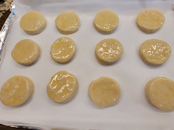
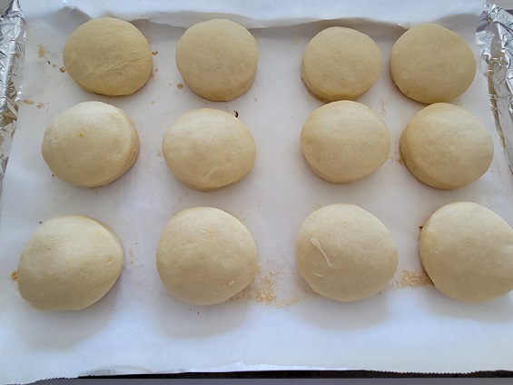
It’s already puffy before being baked! I didn’t have a bunny cutter, so we started out making little cats before deciding circles were easier.
I was a little skeptical about brushing them with melted butter before baking, but they didn’t appear greasy in the slightest after coming out of the oven.
The bottoms got a beautiful golden colour, though!
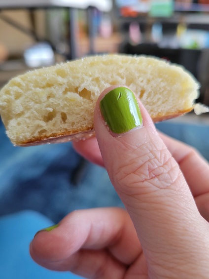
We opted to skip the step of brushing them with more melted butter before turning them into the sugar, but still got plenty to stick because they were still hot when we did this.
Look at that inside! Is it a cake? Is it a cookie? Who cares – it’s tasty as all get-out!
They don’t have as much colour on the tops as the bakery version does, and we think if we make them again we might try an egg wash to combat that. The prepackaged vanilla sugar we used didn’t seem to have a lot of kick, either, so this may require homemade vanilla sugar.
All in all, though, I’m pretty happy with how they came out for a first attempt. It’s nice to have an at-home version for when they’re out of season at the bakery.